


There’s a question that sits underneath most of the money conversations I have these days, and it usually stays unspoken.
How can one generation walk through American life and see abundance — fuller living rooms than humans have ever had, more food, more entertainment, more access — while the next generation walks through the same country and feels structurally crushed? Both are reading the data accurately. Both perspectives are honest. They don’t fit together — until you see the chart that explains how both can be true at the same time.
It was made by an economist named Mark Perry, who calls it the “Chart of the Century.” It’s based on Bureau of Labor Statistics data, and it tracks the prices of major categories of American spending against overall inflation since the late 1990s. It looks like two waves moving in opposite directions.
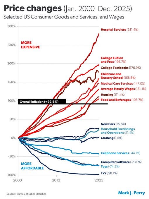
Source: BLS CPI data, visualization by Mark J. Perry, American Enterprise Institute. Latest data: through 2025.
Categories that got more expensive than overall inflation:
Hospital services: up about 240%
College tuition: up about 180%
Childcare: up about 120%
Medical care more broadly: up about 115%
Housing: up about 80%
Categories that got cheaper:
Televisions: down about 95%
Software: down about 75%
Toys: down about 70%
Cellphone service: down about 50%
Clothing: roughly flat
The chart isn’t perfect. The medical and education numbers track sticker prices, not what households actually pay after insurance and grant aid — net costs have risen too, but less steeply than the chart implies. The basic shape is robust; the magnitudes are softer than the visual suggests.
Read the lists once, then read them again, and notice what’s in each column.
The expensive column is everything you have to buy to participate in modern life — a place to live, healthcare when you get sick, the credentials your employer demands, somewhere safe to leave your kids while you work. The cheap column is most of what fills your living room.
This is not a small drift. The economy split into two halves moving in opposite directions. The cheaper categories are the ones you could skip if you had to. The more expensive ones are the ones you can’t. Luxuries got cheap. Necessities got expensive. And we’re living inside the consequences without quite naming them.
Why the cupboards are full
When my grandparents pictured a financial squeeze, they pictured an empty pantry. Their template was the Depression — bare shelves, hand-me-down clothes, no toys at Christmas. Visible scarcity.
That’s not what this looks like.
This squeeze looks like a full living room and an empty doctor’s office. A new gaming console next to a dental visit you keep putting off. A 65-inch TV next to a daycare bill that’s quietly eating half the household’s take-home pay. Cheap takeout, cheap clothes, the latest phone — next to a mortgage payment that, on a household like yours from twenty years ago, is mathematically out of reach.
This is why the squeeze is hard to see and hard to talk about across the people you live and work with. Older relatives walk through younger households and see abundance. The younger people themselves barely register the same objects — to them, the new TV or the gaming console is a rounding error against necessities that cost a hundred times more. Both observations are accurate. The cupboards really are full. And the necessities really are out of reach.
The economy split in two. The half you can see — the TVs, the phones, the full cupboards — got relentlessly cheaper. The half you depend on — housing, healthcare, childcare — went the other way. Most people are judging their financial lives by the visible half while drowning in the invisible one. The squeeze isn’t a failure of honesty about your finances. It’s a structural inversion most people are running their lives without seeing.
What it actually looks like
The cleanest way to feel the chart in your gut is to look at it from the perspective of two specific situations the median household number obscures.
The first is someone trying to launch into adult financial life right now. The Atlanta Fed publishes a monthly index that tracks what share of median household income it would take to afford the median-priced home today — principal, interest, taxes, and insurance combined. The HUD standard for “affordable” is 30% of income. In early 2021, the index sat at 29%, right at the threshold. By late 2025, it had climbed to 47% — partly from rising home prices, partly from mortgage rates that more than doubled in those years. For a median-income household trying to buy the median home today, that purchase would consume nearly half of take-home pay. The rate component is real and partly cyclical; the price-to-income trend underneath it has been climbing for decades.
And the median doesn’t even capture what someone trying to enter the market is actually facing. The median lumps everyone with a foothold — the homeowner who bought in 2015, the homeowner who locked in a 3% mortgage in 2020 — into the same bucket as the new entrant trying to buy at today’s prices and rates. The actual launch experience is dramatically harder than the median suggests.
The second is someone trying to rebuild after a setback. A divorce. A job loss. A serious illness. Any of the ordinary interruptions life delivers without permission. Reentering as a single earner at, say, fifty-five thousand a year, with a six-year-old, rent in most metros now twenty-five hundred to three thousand a month before utilities, daycare another twelve to fifteen hundred just to be able to work, health insurance on top. The math doesn’t add up before you talk about saving. There is no glide path back into the middle-class structure once you’ve fallen out of it. The social safety net catches people only after they’ve fallen most of the way to the floor — which means the bridge between “doing fine” and “needing help” is mostly missing for households that hit a setback in the middle.
What makes both of these situations feel categorically different from previous economic stresses isn’t just the numbers. It’s the absence of levers. When my grandparents faced an empty pantry, the response was do more with less. Repair the clothes. Stretch the meat. Coupon the groceries. Wait for the JCPenney sale. There was always some lever a disciplined household could pull. Effort and patience scaled. They produced results.
The categories that matter most now don’t work that way. There are no coupons for hospitals. There are no holiday sales on rent. You can’t thrift your way to a down payment in a market where the median home costs nearly half a household’s income to buy. Effort still matters — but the kind of effort that scaled against the old categories doesn’t always scale against the new ones.
There’s a wrinkle in the data I see directly as someone who runs payroll: most of the increase in healthcare premiums since the late nineties has come out of employers’ compensation budgets, not workers’ paychecks. The “wages doubled since 1999” comparison is generous to begin with — real take-home purchasing power against the necessities chart grew less than that, by quite a bit.
The middle-class deal that most American adults were raised to believe in — work hard, save a reasonable share, buy a house in your thirties, send the kids to college, retire with dignity — described an actual economy. For most of the second half of the twentieth century, that math worked for most households who put in the discipline.
That economy doesn’t exist anymore. Not because anyone broke it on purpose. Because the price structure underneath it changed. It happened slowly, the way a frog gets cooked in a pot — too gradual to see from inside, until one day you realize the water is boiling.
What broke wasn’t the advice. It was the deal underneath the advice. And no one announced the swap.
Why this happened
Why did the columns split? Several things, working together over forty years.
The first is that some kinds of work don’t scale the way other kinds do. A barber today doesn’t cut hair faster than a barber in 1965. The job is what it is. A worker on a TV assembly line, by contrast, produces vastly more screens per hour — and the TV today is a different, far better product than the TV of 1965, while costing a fraction. Some work resists efficiency. Some work multiplies it. Healthcare, education, childcare, and a lot of housing fall on the side that resists. Economists call this Baumol’s cost disease, after the economist who described it in the 1960s using the example of a string quartet — you can’t perform Beethoven with three musicians or in half the time.
But here’s the point that matters. Baumol exists in every rich country. Healthcare rises faster than headline inflation in Germany, France, Japan, the UK. The structural pressure is universal. So the question isn’t really why is the chart split? — every rich country has a version of this chart. The question is why is the U.S. version worse than every peer country’s? American healthcare costs roughly twice what comparable countries spend per person. American higher education costs are a global outlier. Same structural pressure, more severe outcome.
That gap isn’t pure structural arithmetic. Three institutional and policy choices, in particular, layered on top of the underlying mechanism:
Someone else is paying. In healthcare, the price you see at the moment of service is almost never the price you actually pay — insurance pays the hospital, your employer pays the insurance, you contribute but don’t feel the full bill. In higher education, federal student loans pay the school, with the bill repaid over twenty years. When the buyer doesn’t feel the price, the price drifts higher than it otherwise would.
The supply of qualified people is capped. Federal funding for medical residency slots was capped in 1997 and barely moved for twenty-five years. The U.S. population grew by tens of millions over those decades and aged substantially; the pipeline for new practicing physicians didn’t grow proportionally. Scope-of-practice laws prevent nurse practitioners and pharmacists from doing things they’re trained to do. Supply is artificially constrained while demand keeps rising.
Housing can’t be built where it’s needed. Economists Chang-Tai Hsieh and Enrico Moretti famously estimated the cumulative cost of housing supply restrictions in major U.S. metros at trillions of dollars in lost economic output — though their original figures have been revised downward in subsequent work. The basic pattern is well-established: a small group of homeowners benefits from rules that protect them; the cost falls on people who don’t live there. That asymmetry is why the rules persist.
These three share a pattern. Each is a small group benefiting from a rule that protects them, with the cost spread thin across millions of others. None of those positions is wrong from inside the position. Together, they explain why the U.S. version of the chart is worse than every peer country’s.
A fourth force doesn’t fit this pattern as neatly but compounds the same way. The job got bigger — partly for real reasons, partly not. We genuinely expect more from healthcare and education than we did fifty years ago, and some of that is worth paying for: cancer survival rates, special education services, diagnostic tools that didn’t exist. But alongside the real expansion, the job also grew in ways nobody asked for — credential inflation, administrative creep, paperwork that breeds more paperwork. The useful growth and the parasitic growth show up in the same bill.
The exact contributions of these causes are debated. The U.S. is at the worst end of a distribution every rich country sits on, not in a separate category. Some of why our version is more severe is structural pressure that’s compounded harder here over a longer baseline. But a meaningful share — including the parts most amenable to change — is policy choice.
The new advice
The most useful thing I can offer is a reframe. The math you’re running may belong to a deal that no longer exists, and the discipline that worked for the old deal doesn’t quite map onto the new one. What follows is what the new discipline actually looks like — practical, specific, and grounded in the price structure that actually exists.
The old advice was built for the old world. Save 10% of every paycheck. Coupon the groceries. Repair before you replace. Skip the meal out. Be patient. The people teaching you those rules weren’t lying. The math really did work — they watched it work for most of their adult lives. What changed is which categories the discipline gets applied to. The categories the old discipline targeted got cheap. The categories that matter most for household trajectories today got expensive in ways the old discipline can’t touch.
So the new advice has the same spirit and a different target.
The categories that got cheap are still cheap. If your great-grandparents’ financial discipline involved repairing clothes and rationing meat, ours doesn’t have to. The energy you spend optimizing those categories is mostly wasted; the prices have already collapsed. The discipline that mattered then has been automated away.
The categories that got expensive deserve disproportionate attention. Healthcare, housing, education, childcare — the four pillars — are where money decisions actually move households’ lives. A household that gets one of these right outperforms one that doesn’t, by margins no thrift can close.
What that looks like in practice: choosing a high-deductible plan with HSA eligibility over a low-deductible PPO when you’re young and healthy is a five-figure swing across a decade of contributions and tax-free growth. The premium difference alone can be up to $240 per month for family coverage; add maxed-out HSA contributions compounding tax-free and the gap widens fast. Choosing where to live partly based on school zoning — paying higher rent to be in a strong public district, or driving to a charter or magnet program that’s worth the commute — is six-figure category-selection over a child’s K–12 years. Brookings found that homes near top-performing schools cost an average of $205,000 more than homes near lower-performing ones, and that’s the purchase price alone. A nanny share split with two other families, an au pair through a placement agency, a hybrid of family backup plus formal daycare — these are different price points by tens of thousands of dollars a year, and the default choice (whatever’s nearest, whatever a friend recommended) is rarely the optimized one. The point isn’t that there’s a single right answer in any of these categories — there isn’t. The point is that the questions get answered deliberately, with attention proportional to what’s at stake, rather than by default.
The single biggest lever inside this kind of new-world discipline is geography. Moving from a high-cost metro to a lower-cost one can substantially reduce housing costs — by half in extreme cases, by twenty or thirty percent more typically. Millions of households have made this trade since 2020, and the post-pandemic migration data is among the clearest evidence we have that the lever is real. It’s also worth being honest about what it costs. The hardest part of moving is rarely the move itself; it’s what gets left behind in the place you’re leaving. The grandparent who could have done childcare two days a week. The friend who could have stepped in for a sick kid or shared the carpool. That kind of help has real economic value — tens of thousands of dollars a year in some cases — and you don’t see it on a balance sheet until you’ve moved away from it. The old-fashioned village isn’t nostalgic; it’s a hedge against the cost structure, and giving it up is a real price of geographic mobility. The honest version of the advice isn’t “just move.” It’s consider geography seriously, and weigh what you’d be giving up against what you’d be gaining. For some households the answer is move. For others it’s stay. But the question is now part of the planning conversation in a way it wasn’t for previous generations.
Some of the old rules still work the way they used to. The 401(k) match is one of the few features of this economy that still rewards discipline the way the old rules promised. If your employer offers one and you're not maximizing it, that gap is real money the chart of the century hasn't touched. The match still does what it always did.
The harder truth: even category-aware effort only narrows the gap for households already near the edge of clearing it. For households further from the edge, some old milestones — house in your thirties, college without debt, paid-off home at retirement — aren’t reachable on the trajectory they’re on. There’s no sale, no timing trick, no extra category-selection that closes the whole gap. The advisor’s job, the real one, isn’t to pretend the old map still describes the territory. It’s to help each household figure out which version of the goals is still available, which need to be reset, and how to design plans around what’s actually possible.
The structural piece of this isn’t working, and I don’t want to pretend otherwise. A meaningful share of why the U.S. version of the chart looks worse than peer countries’ is policy choice, and those choices are reversible. The shape of any reform is for legislators and economists to sort out, not for me in this newsletter. There are real policy levers, and the country has been mostly choosing not to pull them.
The thing is, whether and how those questions get resolved happens on a timeline households can’t wait for. The household sitting across from me needs a plan that works in the world that exists, not the one that might exist after a reform cycle. That’s what an advisor is for. The political answer is for somewhere else.
The cupboards are full. The map changed. We plan from here.
Until next time, keep pulling.
— Matthew Davis
Matthew Davis is the co-founder of Sherwood Financial Partners, LLC (”Sherwood”). Sherwood is a registered investment adviser. This platform and this briefing are solely for informational purposes and do not intend to make an offer or solicitation for the sale or purchase of any specific securities, investments, or investment strategies. Investing involves risk and possible loss of principal capital. The information contained herein is not intended to convey or constitute legal or tax advice. Past performance is not indicative of future performance. Comments by viewers or third-party rankings and recognitions are no guarantee of future investment outcomes and do not ensure that a viewer will experience a higher level of performance or results. Public comments posted on this site are not selected, amended, deleted, or sorted in any way. If applicable, certain editing of personal identifiable information and misinformation may be deleted. The opinions expressed herein are those of certain Sherwood personnel and are subject to change without notice. The opinions referenced are as of the date of publication and are subject to revision due to changes in the market or economic conditions and may not necessarily come to pass. Any opinions, projections, or forward-looking statements expressed herein are solely those of author, may differ from the views or opinions expressed by other areas of the firm, and are only for general informational purposes as of the date indicated. Sherwood believes that the content provided by third parties and/or linked content is reasonably reliable and does not contain untrue statements of material fact or materially misleading information. This third-party content may be dated. This briefing may discuss and display charts, graphs, and formulas; these are not intended to be used by themselves to determine which securities to buy or sell or when to buy or sell them. Such charts, graphs, and formulas offer limited information and should not be used on their own to make investment decisions.


